Menu

Dever Blog

Magazine Redesign – A Tailored Fit

pexels-photo-28764_post2

Part 2 – Where do I start?

In Part 1 we covered when the time is right to consider a magazine redesign. In this post, let’s explore how to get started. The key is a careful collaborative partner – one who will ask the right questions and facilitate a process to define and reach your publication’s goals.

  • Review – Schedule enough time for a thorough and thoughtful audit and critique of your existing publication. Review what aspects of your magazine really work well, and which ones require a tune-up or even possible elimination. Consider what new features might enhance your readers’ experience and potentially grow your audience.
  • Plan for Evolution – Consider how your magazine might change over the next several years. Does your publication have a digital edition? Will you require an app or a web-based platform? Anticipating these issues will allow you to design a magazine brand that can transition well as publishing technologies evolve.
  • Refine and define – With the knowledge you’ve gathered, refine your vision and define your goals. Be precise while outlining the specifications but allow space for your design team to explore creative solutions while meeting your expectations. Remember, the better a problem is defined, the clearer the solutions become.
  • Consult the experts – Engaging the right creative team with a range of magazine and publication experience is key to a successful outcome. Whether you’re launching a new magazine or bringing a successful existing brand up-to-date, a knowledgeable collaborative partner can guide the process and advise on best practices.

At Dever Designs we work closely with clients, guiding them through a facilitated process to analyze, define, and deliver superior publications. From turn-key magazines, to templates and style guides for in-house design teams, we have the expertise to take your publication to the next level. Get in touch to start the conversation.
Magazine Redesign – A Tailored Fit

pexels-photo-28764

Part 1 – When’s the right time?

For most associations, a print magazine remains the number one member benefit, especially when supplemented with additional online content. The decision to redesign your magazine is one that demands careful consideration, given the investment of time, effort and resources required to do it right. But how do you know when the time is right?

  • When you look old – While the typical life-cycle of a trade publication may be from 3 – 10 years, you know when the look, feel, and function of your magazine feels antiquated.
  • When you’re out of sync – Communicating, surveying and keeping your finger on the pulse of your readership will keep you informed. When you no longer resonate with your primary audience demographic, or can’t reach new potential subscribers, you’re overdue.
  • When you’ve evolved – If your organization or publication has gone through significant editorial, functional, or structural changes, your magazine can lead the way to educate and inform your audience on how they will benefit. A redesign can create a focal point for signaling that evolution and increasing consumer “buy in”.
  • When you rebrand – In a marketplace where organizations merge or form new collaborative partnerships, a rebranded publication can clarify and crystalize new opportunities created by such joint ventures. A rebrand can also do an excellent job of repositioning an organization that needs to distance itself from an unfortunate history.

In Part 2, we’ll explore how you start the redesign process.

At Dever Designs we work closely with clients, guiding them through a facilitated process to analyze, define and deliver superior publications. From turn-key magazines, to templates and style guides for in-house design teams, we have the expertise to take your publication to the next level. Get in touch to start the conversation.
7 Tips to Strengthen Your Marketing Campaign

fish-icon-01_sm


Two to four seconds. That’s about all the time you have to capture someone’s attention with your online or direct mail promotion.

That means before anyone even reads this sentence, they have already made a decision on whether or not to engage with your content.

With that in mind, we have compiled seven tips to help boost your marketing efforts.

  1. Swim Against the Tide. If you want to stand out against the sea of email heading to your audience’s inbox every day, consider targeting their mail box instead. Direct mail can offer an intimate way to connect with your audience as people open their mail and place it on their coffee table or refrigerator and share it with others.
  2. Variety is the Spice of Life. While direct mail is a great option, we know it takes several touches for a potential customer to take action. Because of that, approaching them through direct mail, social media, email marketing, etc., spreads the marketing to different areas and doesn’t overwhelm your audience in one medium.
  3. Less is More. People have short attention spans. They only read so much. The more succinct you can be in relaying a clear message and giving your audience that motivation to act, the better.
  4. Have a Clear Call to Action. The last thing you want is your audience wondering “So what do you want me to do?” Make it easy for people to see what you want, why they need you and why they should want to work with you or buy your product. How can you make their life better?
  5. Consistency is Key. The audience should be able to recognize a campaign as coming from your organization through consistent branding, graphic treatments, photography, and messaging. While the campaign should be a reflection of your overall brand, it can have its own sub campaign brand that complements the organization’s parent brand.
  6. All About Balance. Whether the duration of your campaign is lengthy or short, it takes multiple touches for someone to remember who and what you are. However, as you reach out to your audience, be cognizant not to chase away the very people you’re trying to attract. There’s a balance between multiple touches and overwhelming your audience.
  7. Track Your Response. Since you’ll have multiple touch points for your campaign, you’ll want to know which avenue is the most successful so you can channel a greater part of your efforts in that direction. When sending out email content, add tracking links so you can see who is opening your content and when. In a direct mail piece, provide a specific call to action that lets you know if people are engaging with your campaign.

Need help creating a campaign that stands out? Get in touch today to start the conversation.

Dever Designs Teams Up With Ocean Conservancy to Talk Trash

Ocean Conservancy Reprt
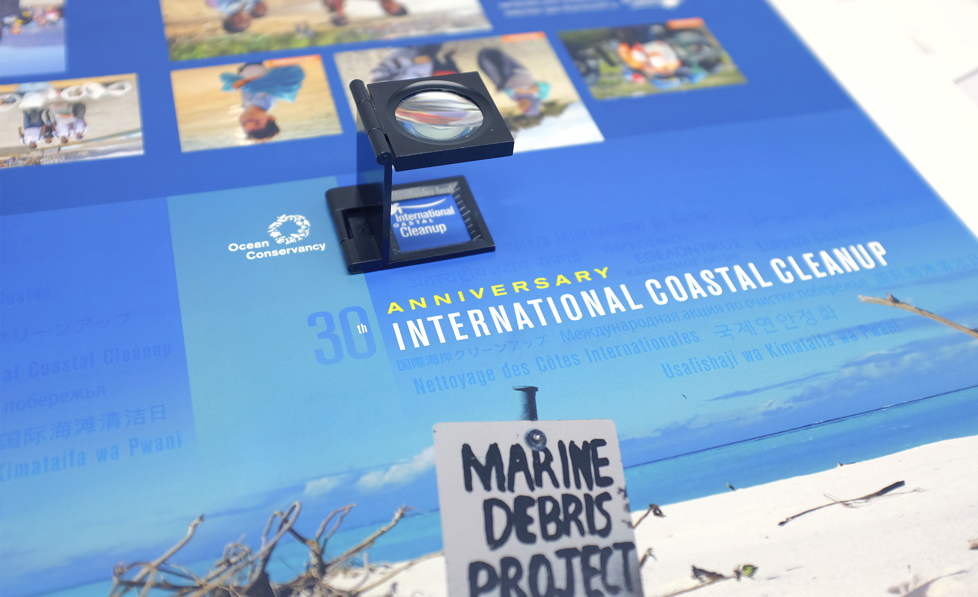
Reviewing the cover press proof


If you had to guess what the most collected item of trash along the world’s beaches and waterways was in 2015 was, what would you say?

Would your guess be bottle caps? Perhaps plastic bags?

It turns out that in 2015, through Ocean Conservancy’s International Coastal Cleanup, volunteers collected 2,127,565 cigarette butts.

For 30 years, Ocean Conservancy’s International Coastal Cleanup has engaged people to clean trash from beaches and waterways spanning the globe. In 2015 alone, more than 18 million pounds of trash was collected by nearly 800,000 volunteers as part of this effort.

Dever Designs was proud to help highlight the scale of the organization’s work in a visually engaging format as we partnered with Ocean Conservancy on their 2015 Ocean Trash Index.

To help illustrate their story and accomplishments in a compelling way, we first changed up the 8.5” x 11” report format to an 11” x 9” horizontal size, giving the report more of a coffee table book feel. We incorporated feature photos and quotes from volunteers to help tell the organization’s story, while designing powerful infographics to quantify the impact of the International Coastal Cleanup.


Ocean Conservancy Report
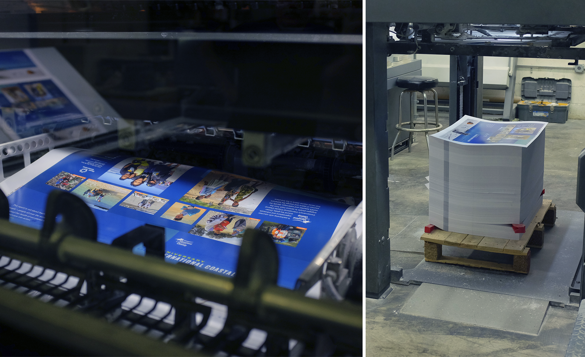
The first sheets, fresh off the press


Ocean Conservancy distributed the report on their website and in print to the cleanup coordinators around the world. The print copies were produced with crisp details and bright colors by our partners at Cavanaugh Press on their 40” 6-Color Heidelberg Speedmaster 102 press.

Working with organizations that make the world a better place is something that energizes us to do our best work. We were honored to help Ocean Conservancy highlight the 30th anniversary of its International Coastal Cleanup.

Click here to see the finished piece.

See how we can help your organization spread the word. Take a look at our portfolio and get in touch to start the conversation.
Infographics Speak Volumes

Infographics come in all shapes and sizes. Some are more whimsical and illustrative, while others take a more simplified format. No matter what type of infographic you choose to use, all can help convey a message to your audience in a visually interesting way.

Some of the benefits of using an infographic include:

  • Capture a reader’s attention quickly
  • Help break up text-heavy reports
  • Succinctly convey your message
  • Easily repackaged and shared across various platforms
  • Useful tool to convey financial information and statistics
  • Serve as a portal to additional information

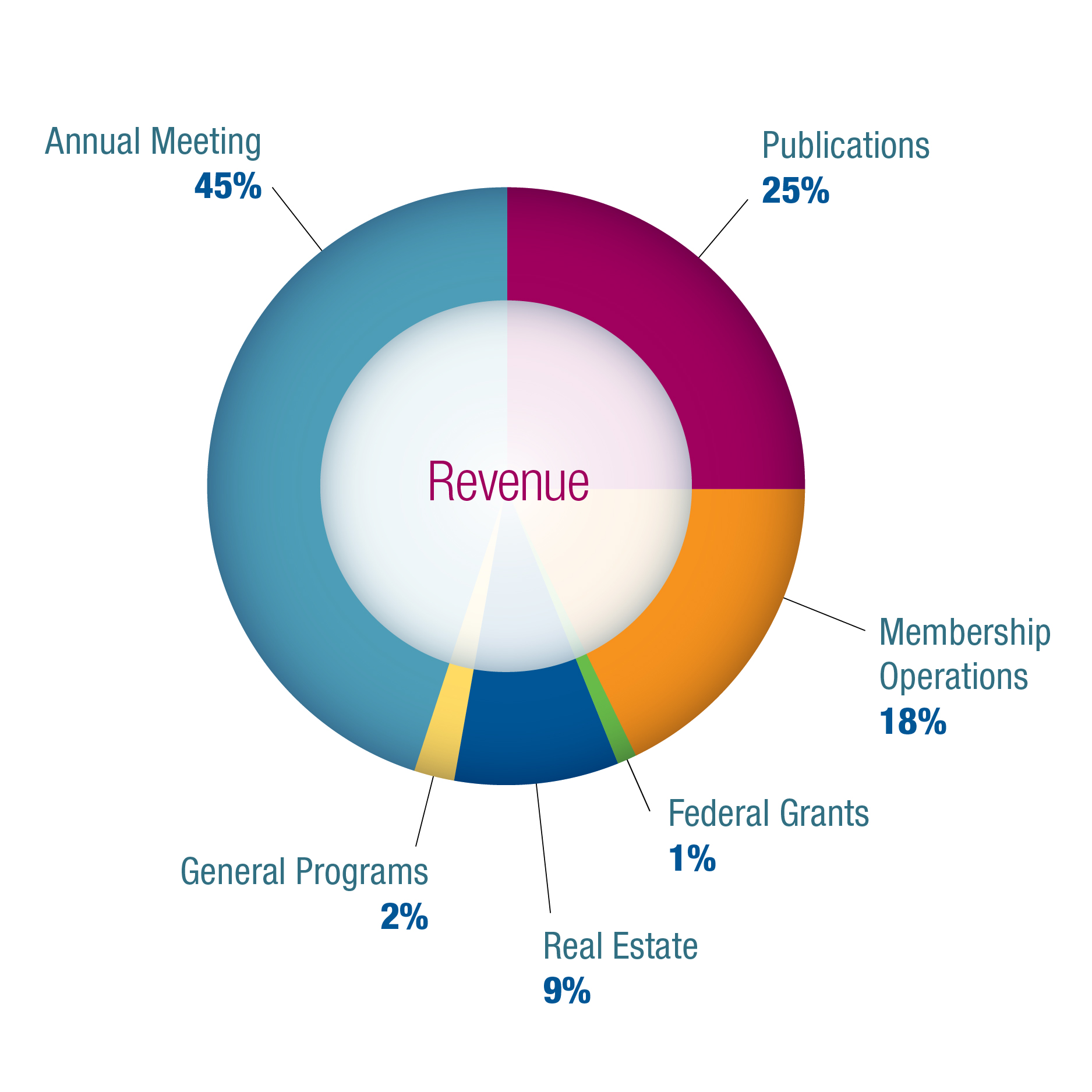
If you’re looking to create a cost effective graphic that’s more visually appealing than simply presenting a spreadsheet, you can go the route of a pie chart, bar graph or scatter graph. Data-heavy information translates well in this format and makes complex information more easily digestible for your audience.


Pie Chart


This type of infographic is also an engaging tool for a nonprofit organization striving to be financially transparent to donors without having the reader dig through a spreadsheet.

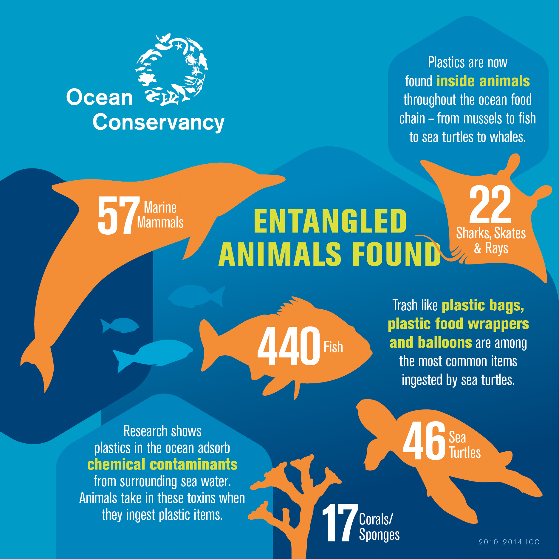
On the opposite end of the spectrum is the more illustrative infographic that takes what could be considered “dry” data and makes it come alive through illustrations, comparisons, telling a story or explaining a process.

For example, in this infographic from their annual data report, Ocean Conservancy visually shows the audience the story of how sea life is affected by trash.


10_Entangled_Animals-01


This type of narrative creates more of an emotional appeal, which is an effective way of reaching the Ocean Conservancy audience.

Whether you’re creating a data-driven graphic or one that is more of a emotional narrative, it’s important to focus on color contrast, clarity and simplicity to ensure it is easily accessible. Creating a successful infographic for print, a website, social media or a mobile platform means knowing your audience and being clear in the message you’re trying to communicate.

Looking for some help in creating infographics for your organization? Call Dever Designs at 301-776-2812.

Maximizing Your Trade Show Experience

Trade_Show


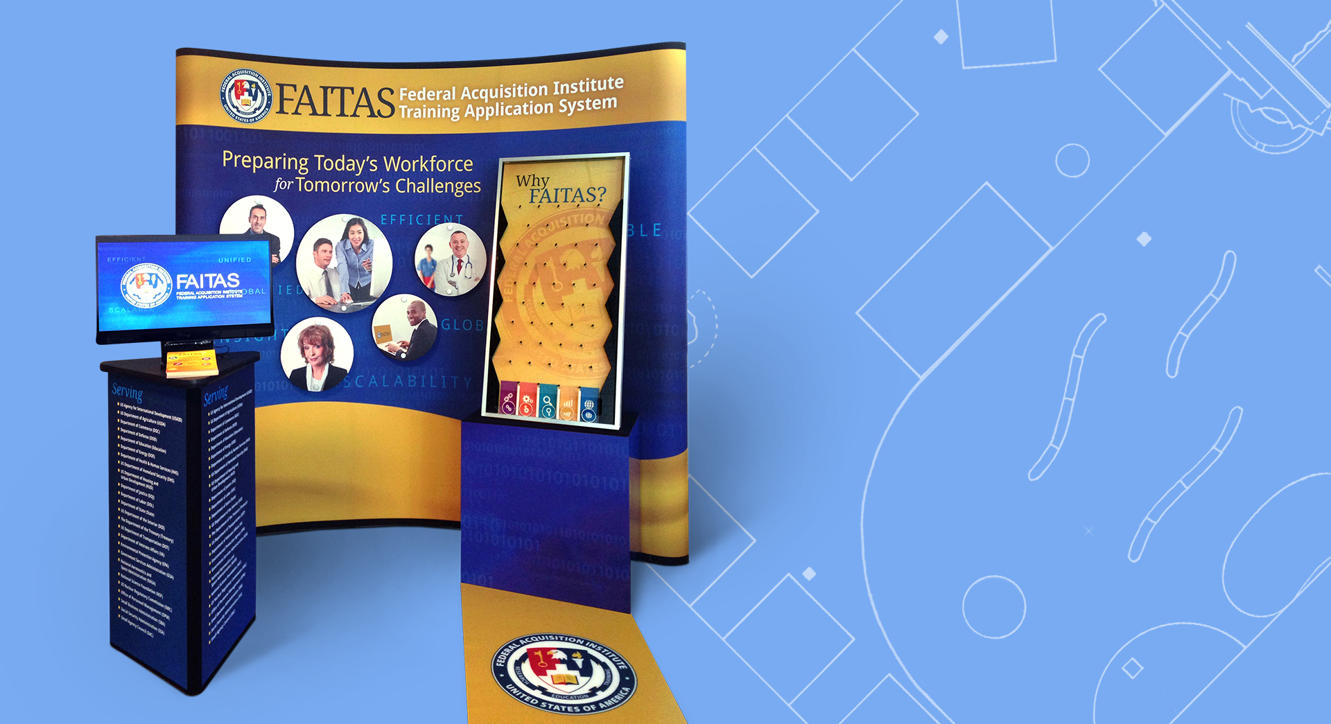
Ten feet might not sound like much space…until you find out that you have to put together a 10 x 10 foot trade show exhibit for your nonprofit organization this fall.

Suddenly, 10 feet seems like the length of a football field.

As daunting as it might seem to be tasked with organizing and running your organization’s exhibit, an experienced design firm can help you maximize your trade show experience.


Getting Started

To begin, a design firm will help you outline the scope, scale and goals of your exhibit.

How big is the booth area you have to work with? What are you hoping to achieve?

Are you trying to increase general awareness about your organization? Are you attempting to boost membership? Are you introducing a new product or simply trying to network?

Once those questions are answered, you’ll need to develop a budget and timeline. When it comes to the schedule, it’s often helpful to work backward, beginning with the date of the trade show.


Think Ahead

It can be challenging to think down the road when you have so much work to do right now, but it’s important to consider how you might use your exhibit materials in the future. For example, beyond your immediate needs, could you use that banner stand at an event two months from now? If so, it might behoove you to spend more on a quality product that can be used multiple times.

Not sure how you can repurpose your exhibit materials? An experienced design firm can advise you and tailor creative solutions to your specific needs.


Rent or Buy?

Your budget and the decisions you have made regarding material re-use will dictate whether you rent or buy your hardware and accessories. Renting can seem like the more affordable option, but experienced designers may have some great leads on where to purchase unique materials. If you do purchase, it’s important to buy something durable, that can be shipped multiple times, and to use product lines that are likely to be in existence for years to come.


Promoting Your Exhibit

The promotion of your exhibit is actually a pretty big piece of your project. First, you need to work with your design firm to create eye-catching save-the-date cards and other marketing collateral to draw attendance.

Next, you want to do something to help your exhibit space stand out.

To draw traffic, you could:

  • Feature an interactive game
  • Offer a promotional giveaway
  • Hold a contest

Your exhibit also presents an opportunity to gather information from your potential customers. You might ask them to sign up to receive your newsletter or have them leave their business card as part of a raffle. Consider what information could allow you to continue to reach out to your audience long after the trade show ends.


The End Result

Having a design partner who is involved early can help you to come up with the best options to meet your short- and long-term goals. An independent design firm will not only guide you every step of the way, but will also improve your ROI.

Take a look at the range of trade show exhibits that we’ve designed in our portfolio.

To see how Dever Designs can help you with your trade show exhibit, be sure to give us a call as soon as possible at 301-776-2812.

‘A Wonderful Experience’

Brianna Kittleson


When you think back to your first internship, you probably remember feeling excited and perhaps a bit nervous. After all, this was your foray into the professional world, the first steppingstone in your career journey.

At Dever Designs we are fully invested in the internship process. People were good to us when we were setting off on the graphic design career path, and we feel, in a way, that we owe something back. We’re thrilled to play a part in building the next generation of designers.

This summer we were pleased to work with aspiring designer Brianna Kittleson, a Maryland resident who recently completed her freshman year at Andrews University in Michigan. We offered her a peek into a real-world working environment, allowing her to observe how a studio runs, gain working knowledge of the craft and help us where possible.


Below is her take on her summer experience.

Interning has been a wonderful experience. I have learned and grown so much in just a short period of time. As I head back to school I feel like I have a much better understanding of this field and the kinds of things that come along with it. While working here I have been able to observe and participate in a variety of things. One of the many things I have learned is that attention to detail is key. Watching Jeff as he tweaked colors or adjusted text made me recognize that making even the smallest changes can be the defining factor in pulling a piece together.

Here at Dever Designs, I have noticed the extremely organized manner in which they approach every project that comes their way. It creates an incredibly efficient working environment and personally I will now try and apply these same principles as often as I can.

Another thing I have seen from working here is the importance they place on the interactions between the designer/project manager and the client. It is a huge part of the design process and I can now see how important it really is. Everyone has given me so many insider tricks of the trade and pieces of advice and I am excited to apply them as often as possible. 

My favorite project was when they had me lay out a feature story for my own magazine. I used programs such as Illustrator, InDesign and Photoshop to create a feature on a family that runs a farmer’s market. This is a piece I will be able to add to my portfolio.

Internships can and do make a difference. The second employee we ever hired at Dever Designs was an intern who stayed with us 23 years.

To learn more about how Dever Designs can serve you, visit deverdesigns.com

Can I Get a Little Help Here?

Imagine sitting in a small swimming pool filled with ping-pong balls and being asked to hold all the balls under water at the same time. Inevitably, juggling all the ping-pong balls becomes too much and they start popping up to the water’s surface.

The life of an in-house marketing/communication team can sometimes seem like this when several projects are coming down the pike at once, and there simply aren’t enough hands on deck to complete the work.

Fortunately, an experienced outside design firm is a great resource for handling any overflow work that pops up.

Since in-house design teams are typically small, it can wreak havoc on scheduling when a staff member is on vacation, experiencing a health emergency or out on parental leave. Utilizing an experienced design firm is a great way to alleviate that stress. Even if your full team is present, having a major design project coming up on top of your regular work schedule can seem overwhelming.

A seasoned design firm can jump in and help with the following:

  • Large projects (e.g., conferences)
  • Evolving brands
  • Annual Reports
  • Special One-time Projects
  • Exhibits
  • Membership Campaigns
  • Media Kit

In addition to providing relief, a design firm can serve as a consultative partner. An expert design team has experience from which to draw, so you can be confident in the work they perform and the advice they offer. They can anticipate potential issues (helping you keep all your ping-pong balls under control) and bring a depth of experience to everything from specialty reports to conference packages.

If there’s anything we can help you with, reach out to Dever Designs at 301-776-2812.

Behind Every Good Brand is a Good Brand Guide

Brand Guides


Your brand represents everything your organization is. It encompasses the visuals, the messaging, and even your organization’s personality. That’s why when it comes to presenting your brand to the public, you want to get it right.


Why do you need a brand guide?

As a company reveals a new or updated logo, it may seem like all employees are initially on board regarding its usage.

But what happens when Nadia in marketing is creating a new social media profile picture and skews the size of the logo to make it fit her needs? Or maybe Alex in accounting decided to have some T-shirts made for a golf fundraiser, but preferred a different shade of gold than what was approved for the logo?

When it comes to protecting, promoting and presenting your brand, consistency is key. That’s why creating and using a brand guide is so essential. A good brand guide will accommodate creativity while policing the parameters.


The Value of a Brand Guide

  • Helps maintain control of the brand
  • Helps provide direction and focus, keeping everyone on target
  • Spells out and reinforces the tone of your organization
  • Empowers employees to keep the brand cohesive

Applying aspects of your brand willy nilly or allowing employees to have a free-for-all with the logo is equivalent to not even having a brand at all. It’s essential to have and maintain brand standards that all employees will follow.


Components to the Brand Guide

A brand guide can be as in-depth as what you might imagine a company like Walt Disney would utilize, or it can be short and sweet, depending on your needs and budget.

Visual – Every element of your brand, from the logo to stationery to supporting graphic elements needs to be consistent. Colors, typography and even details such as the amount of white space around your logo, should be carefully outlined in your company’s brand guide. This guide will define the parameters within which you communicate your brand at every level.

Voice – How your organization presents its tagline or other standard language will also be outlined in the brand guide. When, and how, you use this messaging, as well as its legibility, are important aspects of branding.

Tone – Every organization has a particular way in which they interact with their audience. This can mean they take on a friendly and helpful tone or perhaps more of an authoritative, industry expert approach. The brand guide will help define your organization’s personality, which will be captured in industry messaging moving forward.

A brand guide can be distributed in print format, although, increasingly, companies are making it available in a digital format, either as a PDF or a microsite. It’s important to know that the brand guide will constantly evolve as new issues come into play. Be sure to work with your design firm to keep your brand guide up-to-date.

Want to take a fresh look at your company’s brand guide?
Give us a call at 301-776-2812.

Summer—The Perfect Time to Add Some Sizzle to Fall Projects

Summer To-Do


It’s mid-summer. You’re probably thinking about your toes in the sand or lounging poolside. While it may be difficult to maintain your focus on work, the summer is actually the perfect time to get a jump start on fall projects like your organization’s annual report, membership campaigns, and fall conferences.

Get cracking on your annual report
Tracking your organization’s achievements over the course of the year, locating the best photos and highlighting donors can seem like a daunting task. But it doesn’t have to be! Take advantage of a quiet office and slower summer pace to gather and organize news and photos from the year. This could be a great project and resume builder to pass along to the summer intern.

Think about themes that encapsulate the past year or the spirit of your organization. You can also build a theme around a large-scale event or major strategic organizational push. Talk to your design firm early to clarify what you’re trying to achieve or convey with your report. They will be able to share your organization’s story through format, graphics and production techniques.

Boosting membership
Yes it’s hot outside, but before it starts heating up in the office, begin coordinating your fall membership campaign. First, look at the data and outcomes of previous membership drives to see what methods were most effective. Plan a mix of print, digital and social media marketing. It’s important to reach out across multiple channels to ensure your audience is being reached. An email message could potentially be overlooked, while a colorful postcard may be just the piece of collateral to capture your audience’s attention. Want to target a new demographic? Try to reach them on a medium where they are actively engaged.

Fall conferences
Your big conference might take place in the fall, but it’s never too early to begin brainstorming and planning about brand collateral and more. Slow summer office days are the perfect time to work with your design firm on “Save the Date” notices you can send out ahead of schedule to keep your conference front of mind for your target market. Keep in mind it’s going to take several touches to keep guests intrigued and excited about your event. Start planning a branded email, e-newsletter, post card, etc., that clearly highlights the value of your event. Some organizations are even creating apps to communicate regularly with attendees and keep them in the loop about conference events and activities.

In addition to alerting your audience about the event, you’ll also need to create collateral to distribute to attendees once they arrive. Begin working with your designers in advance to create clear and organized programs and onsite guides that highlight speakers and workshops and offer a general awareness of what your conference has to offer.

And don’t forget the giveaways! Conference attendees get excited about tchotchkes, particularly useful items such as T-shirts, USB sticks, tote bags, hats and other apparel that your design firm can help brand to your event. Remember, the better the experience your guests have at your event, the more likely they will be to attend next year.

Dever Designs is happy to help you with your planning process. Visit deverdesigns.com or call 301-776-2812.