The Direct Selling Association (DSA)
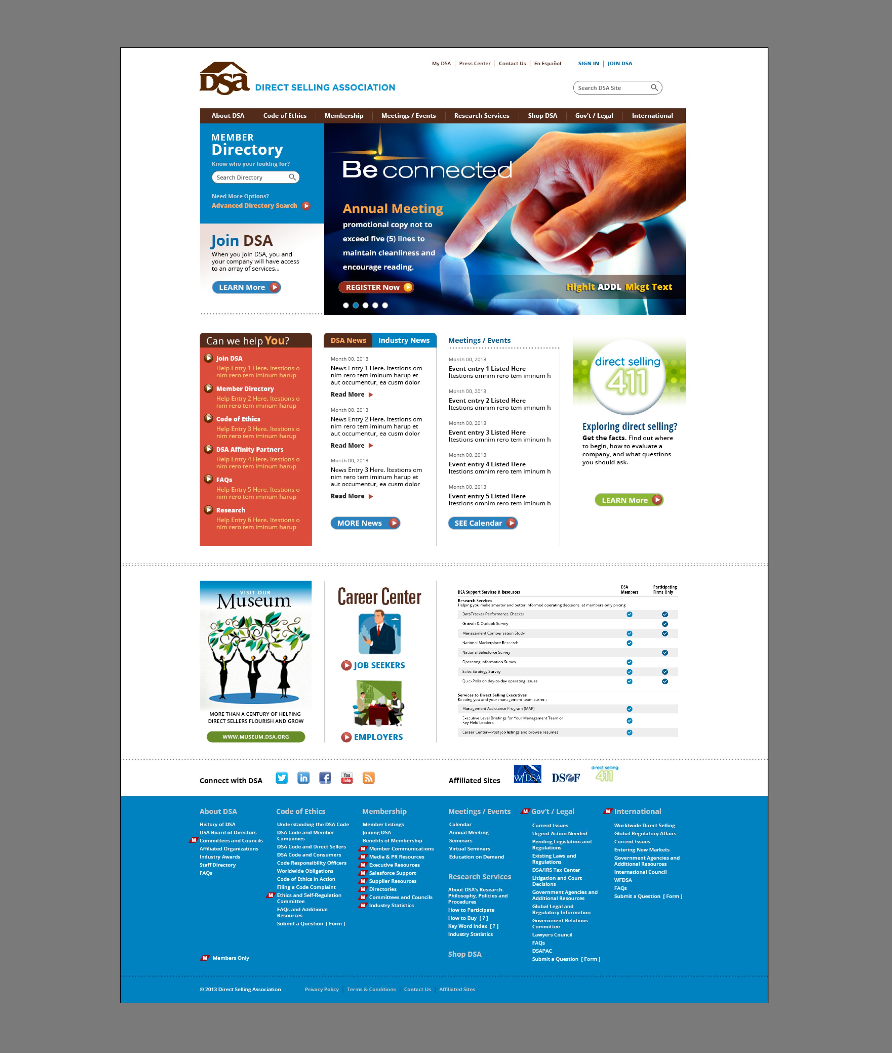
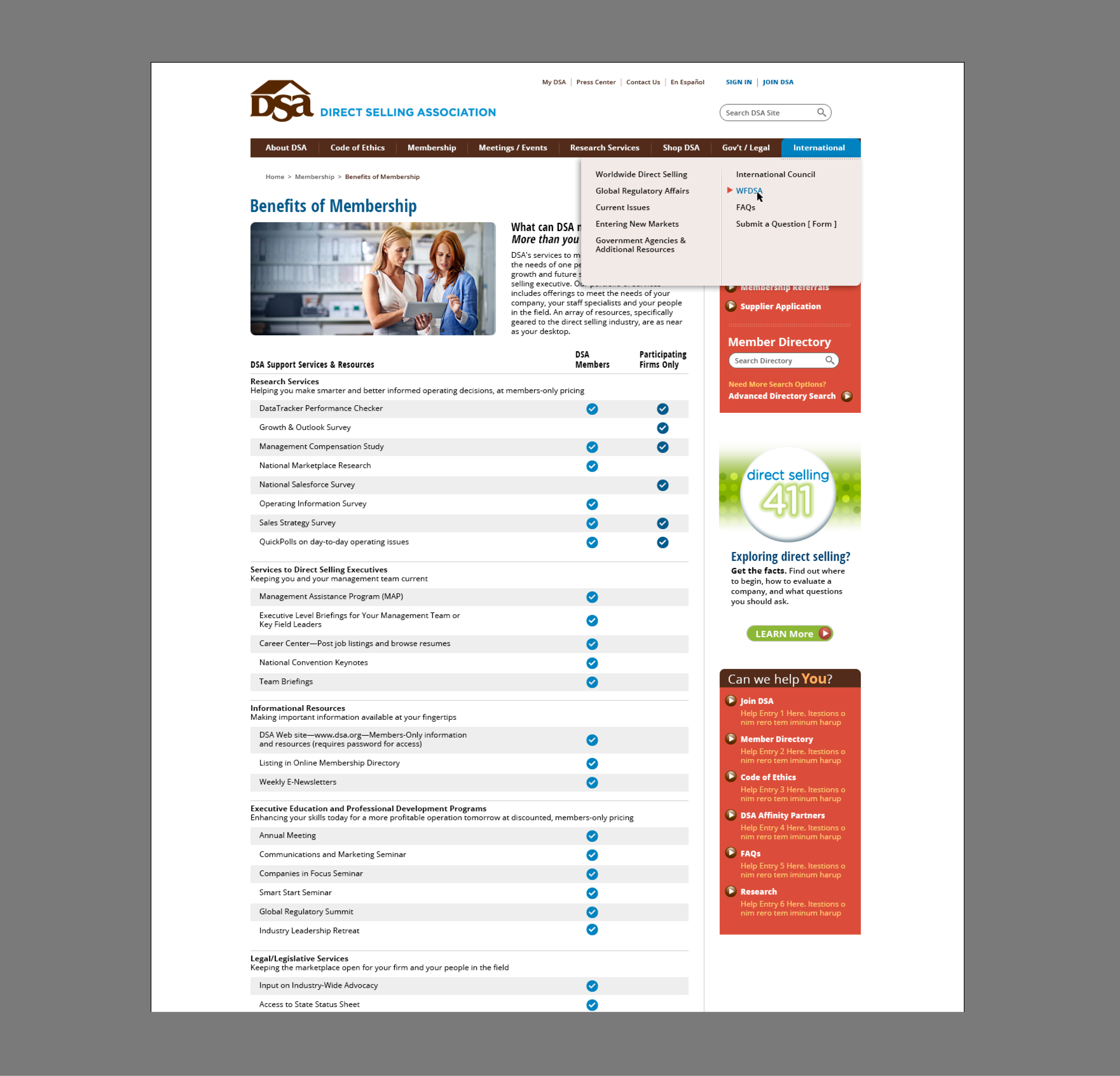
A surge in phone inquiries for information readily available on their website spurred DSA to contact our team for a site redesign. We determined that crowding the home page with too much disparate content was confusing and led visitors to abandon the page in favor of the phone. By assessing the content of the entire site, we prioritized key messages—making vital member resources accessible and visually engaging on the home page. More intuitive navigation included mega menus to easily reach in-depth content, quick links to the most requested information, and an integrated graphic link to their general information microsite.
Creating an appropriate hierarchy of content not only directed traffic to the information they wanted, but also introduced visitors to previously untapped resources offered by DSA. When coupled with dynamic images that spoke to their membership and coordinated with action statements, redesigning DSA’s site helped position them as the preeminent authority and resource for their industry.
View More:


